SONAR Market Dashboard
2023
SONAR is a leading data analytics and freight forecasting platform designed for the logistics and supply chain industry. It provides real-time, high-frequency data and actionable insights to help shippers, carriers, brokers, and 3PLs optimize transportation decisions.
Impact
$20M ARR, 4.5 G2 Review Rating
Role
Product Designer
Duration
March 2023 – June 2023
Team
Gabriela Rivas, Jordan Clark, Jeremiah Reid
Tools
Figma, Jira, Heap
Scope
UI/UX, Design System, Wireframing, Prototyping, User Research, Usability Testing
Design Problem
The SONAR user interface faced significant challenges that impacted both usability and performance. The design was outdated and lacked a cohesive visual identity, making it appear cluttered and unintuitive. There was no consistent style guide, component library, or grid system, resulting in non-standardized UI elements and a fragmented user experience. Users struggled to navigate the interface, as critical UI elements were either difficult to locate or not visually distinct, leading to frustration and increased task completion times.
In addition to design issues, the platform was built on legacy code, which contributed to sluggish loading times and suboptimal performance. The lack of responsive design further compounded usability challenges, as the interface did not adapt well to different screen sizes or devices. This created barriers for users accessing the platform on tablets, laptops, or smaller screens, significantly limiting its accessibility and functionality.
These limitations underscored the need for a complete redesign, focusing on standardization, accessibility, and responsive design. By implementing a grid system, modernizing the codebase, and ensuring the interface was fully responsive, the redesign aimed to provide a seamless and efficient user experience across all devices.
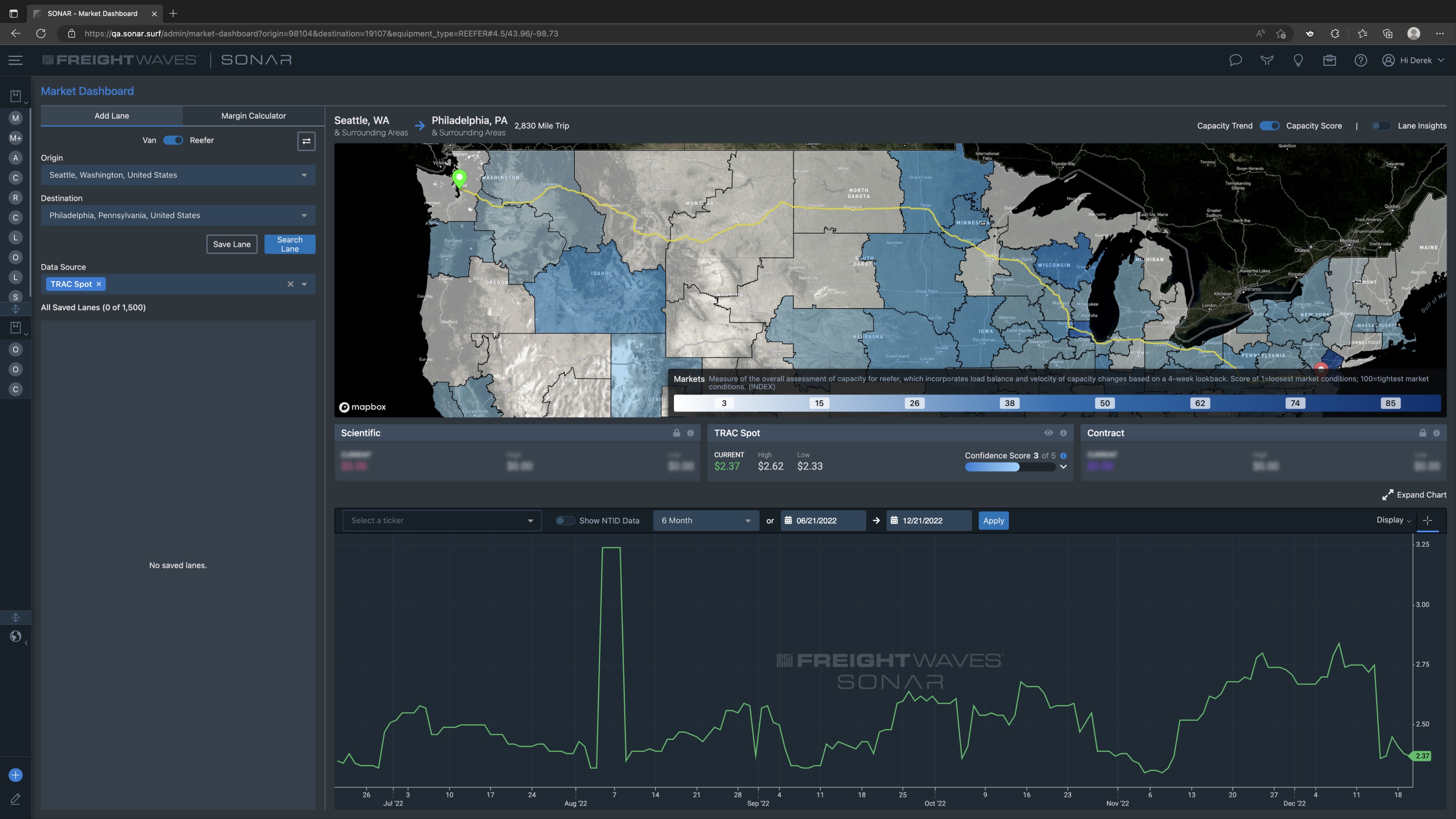
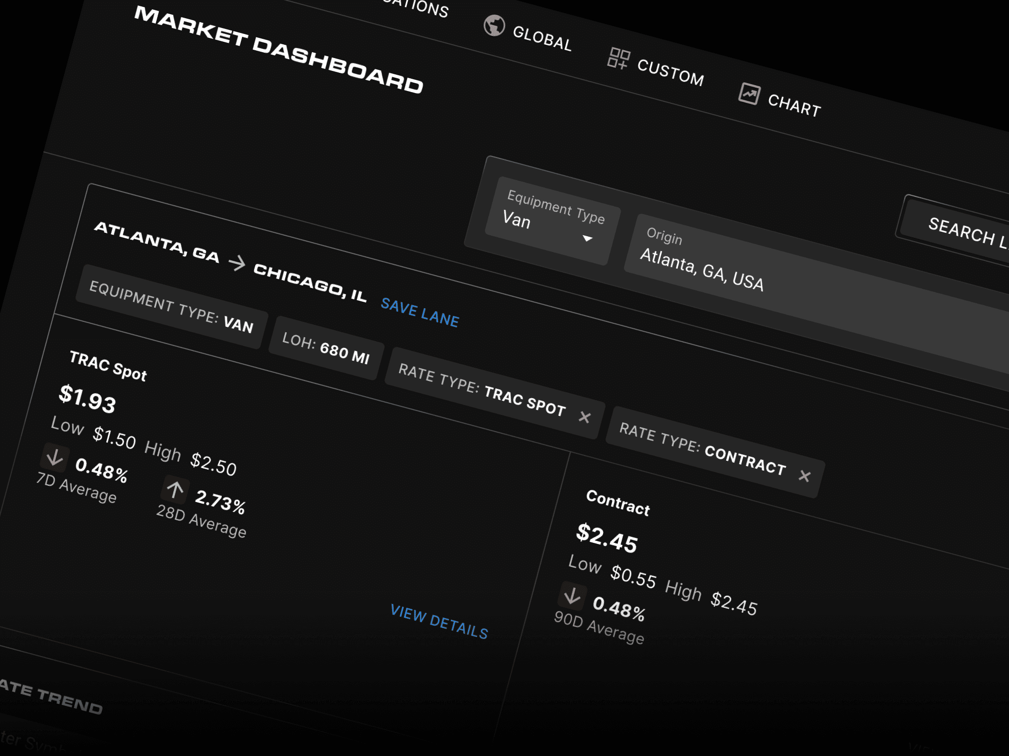
The SONAR Market Dashboard user interface prior to the refresh.
Customer Interviews
During the research phase of the project, we conducted interviews to guide the design process. Collaborating with the team, we developed an interview script with 32 open-ended questions aimed at understanding our target audience's values, motivations, and daily routines. Over the course of four days, we recruited and remotely interviewed seven users. The insights gathered from these interviews became a key reference throughout the design process.
Findings
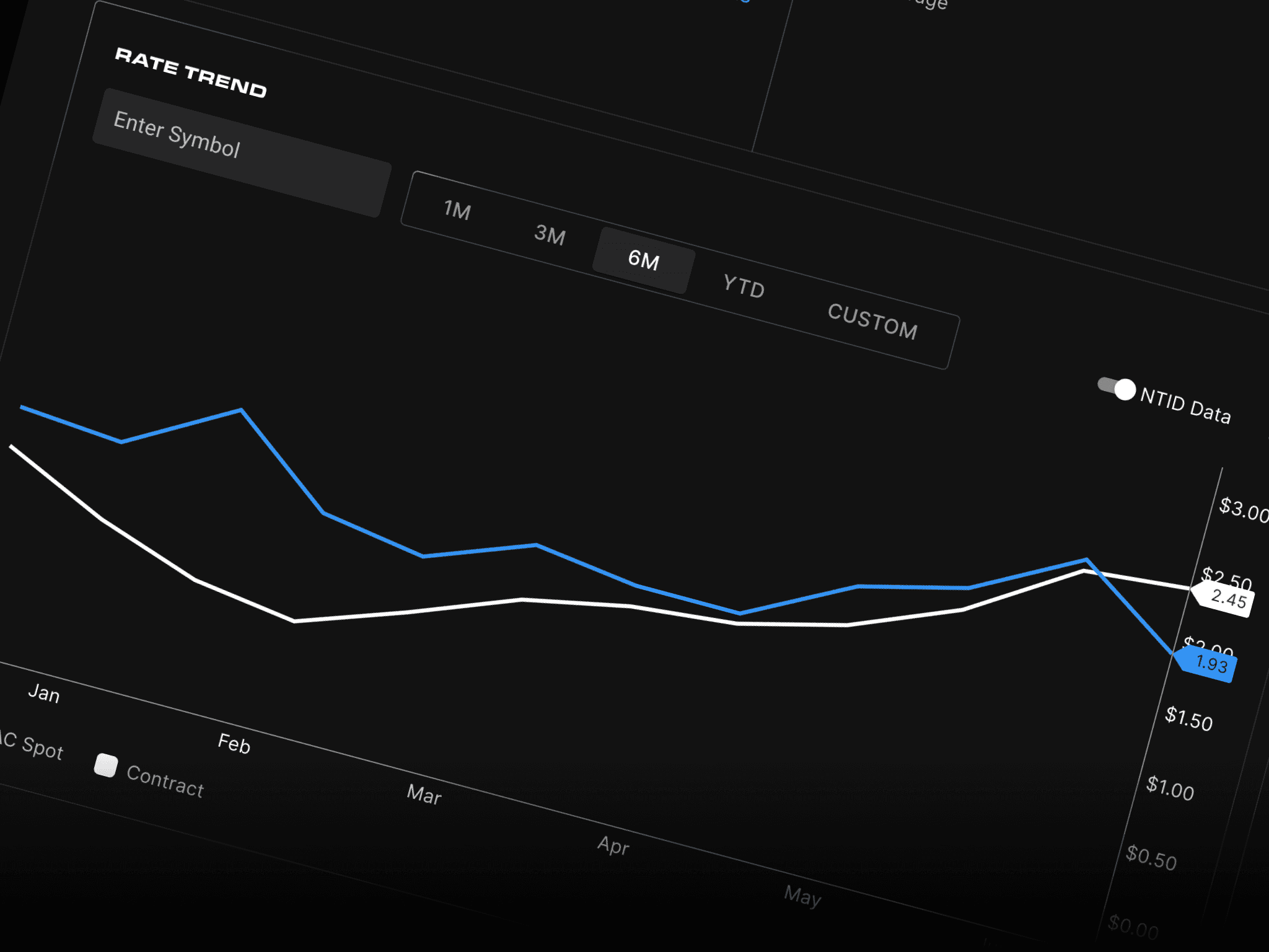
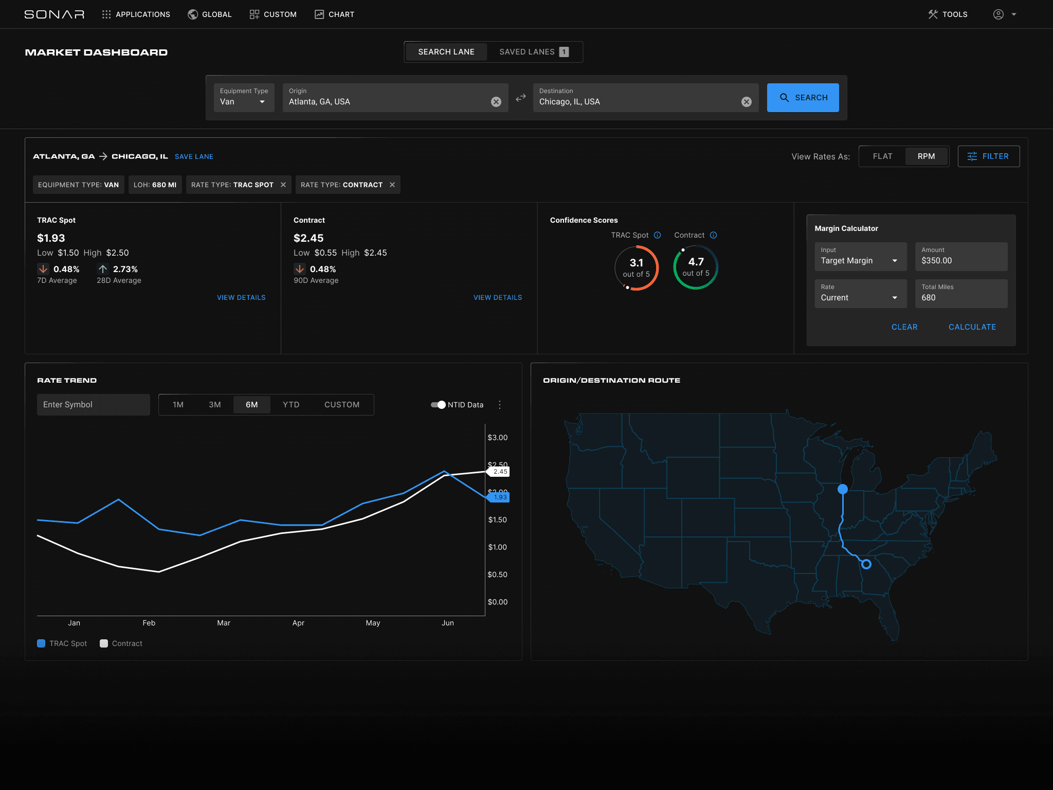
The rates should be the primary focus of the page, rather than the map.
The map was contributing to slower page load times.
Users wanted the ability to view both the All-In Rate and the Rate Per Mile.
Many users appreciated the design approach used by GreenScreensAI.
Competitive Analysis
We reviewed our two main competitors, GreenscreensAI and DAT Freight & Analytics.
GreenscreensAI
Greenscreens.ai specializes in dynamic pricing solutions for the freight industry, utilizing artificial intelligence to provide real-time market rates and predictive analytics. Its focus is on delivering accurate pricing to enhance profitability and operational efficiency.
DAT Freight & Analytics
DAT offers a comprehensive suite of tools, including load boards, rate analytics, and market insights. Known for its extensive database, DAT provides users with access to a large network of freight data, facilitating informed decision-making in logistics and transportation.
Key Comparisons
Data Accuracy and Timeliness: All three platforms emphasize real-time data; however, the specific data sources and update frequencies may vary, potentially impacting the precision of market insights.
User Experience: User interface and ease of navigation differ across platforms.
Some users have found DAT Load Board easier to use compared to SONAR.
Greenscreens.ai has a simple, clean interface that is clear to navigate.
Integration Capabilities: The ability to integrate with existing systems is crucial.
Greenscreens.ai and DAT offer various integration options, which can streamline workflows and enhance efficiency.
Specialization:
Greenscreens.ai focuses primarily on dynamic pricing, while
DAT provides a broader range of freight services, and
SONAR concentrates on market forecasting and analytics
Wireframes
We developed our wireframes by synthesizing insights gathered from customer interviews and the competitive analysis, ensuring that our designs were rooted in user needs and industry best practices. This approach allowed us to prioritize features and workflows that addressed key pain points while also leveraging opportunities identified during the analysis.
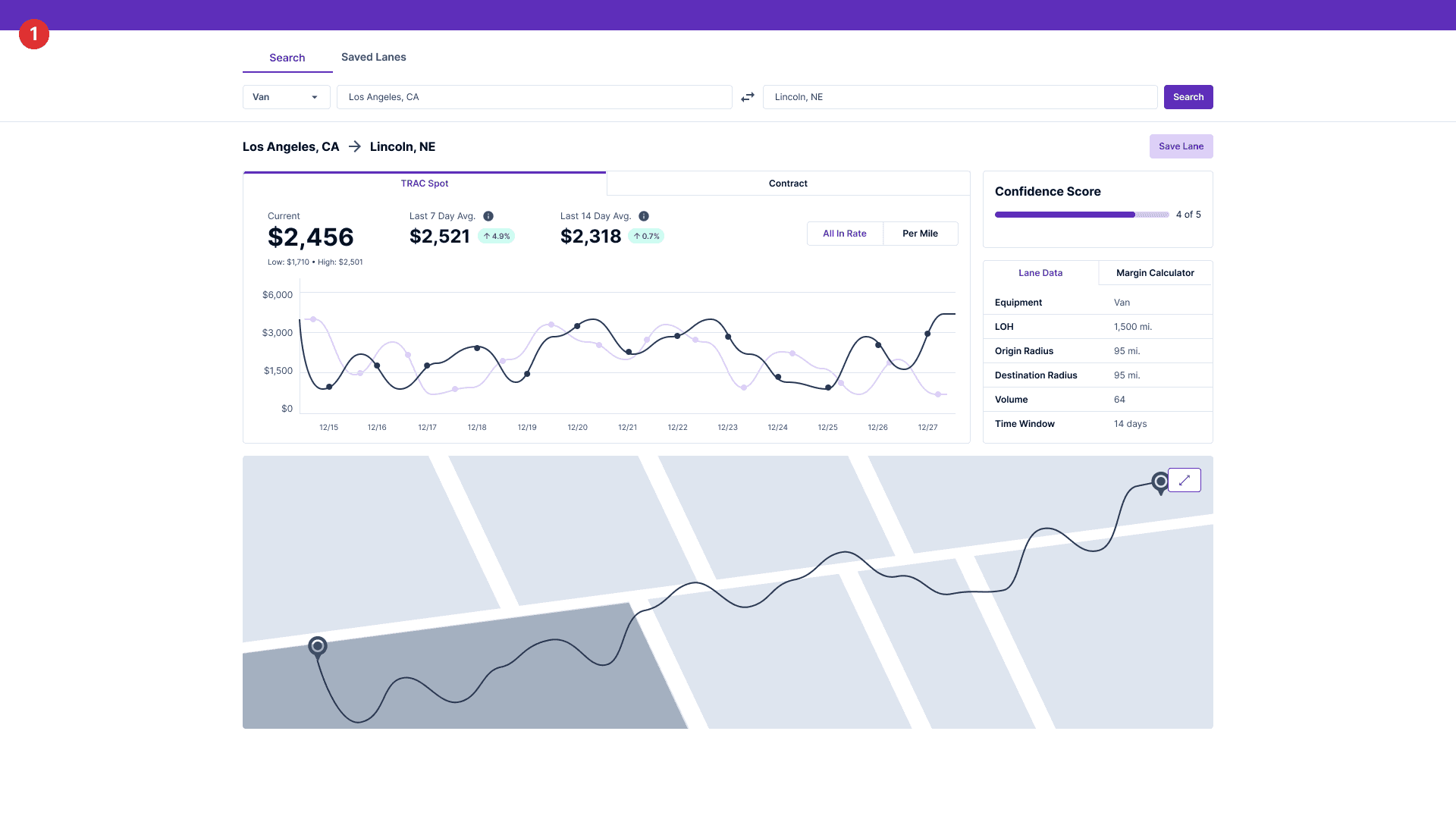
We incorporated key user feedback into our designs to enhance usability and performance. First, we shifted the focus of the page to prioritize the display of rates rather than the map, as users indicated that rates were the most critical information for their decision-making. This adjustment not only improved the overall user experience but also aligned the interface with their primary goals.
To address concerns about performance, we minimized the map's prominence since it was contributing to slower page load times. By optimizing its functionality and reducing its size, we improved loading speeds while still retaining the map as a supporting feature for context.
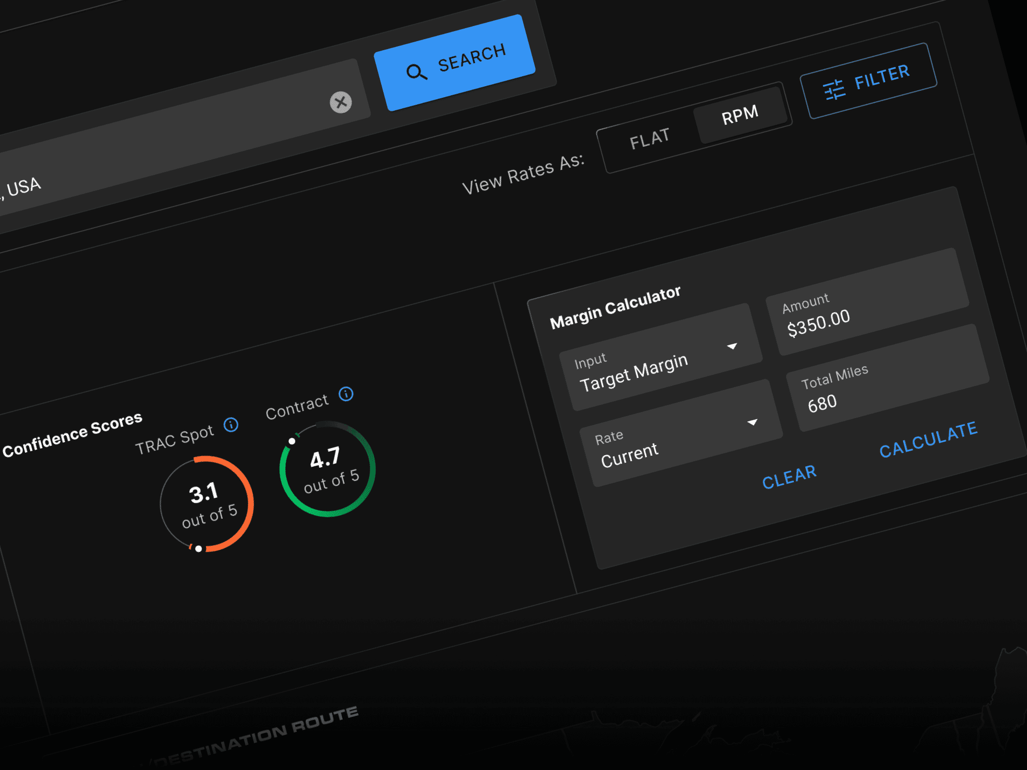
Additionally, we added the option for users to view both the All-In Rate and the Rate Per Mile, offering greater flexibility and catering to varied user preferences.
Finally, we drew inspiration from the design approach used by GreenScreensAI, which many users praised for its intuitive and efficient interface. This informed our efforts to streamline navigation and modernize the overall aesthetic, ensuring a user-friendly and visually appealing experience.
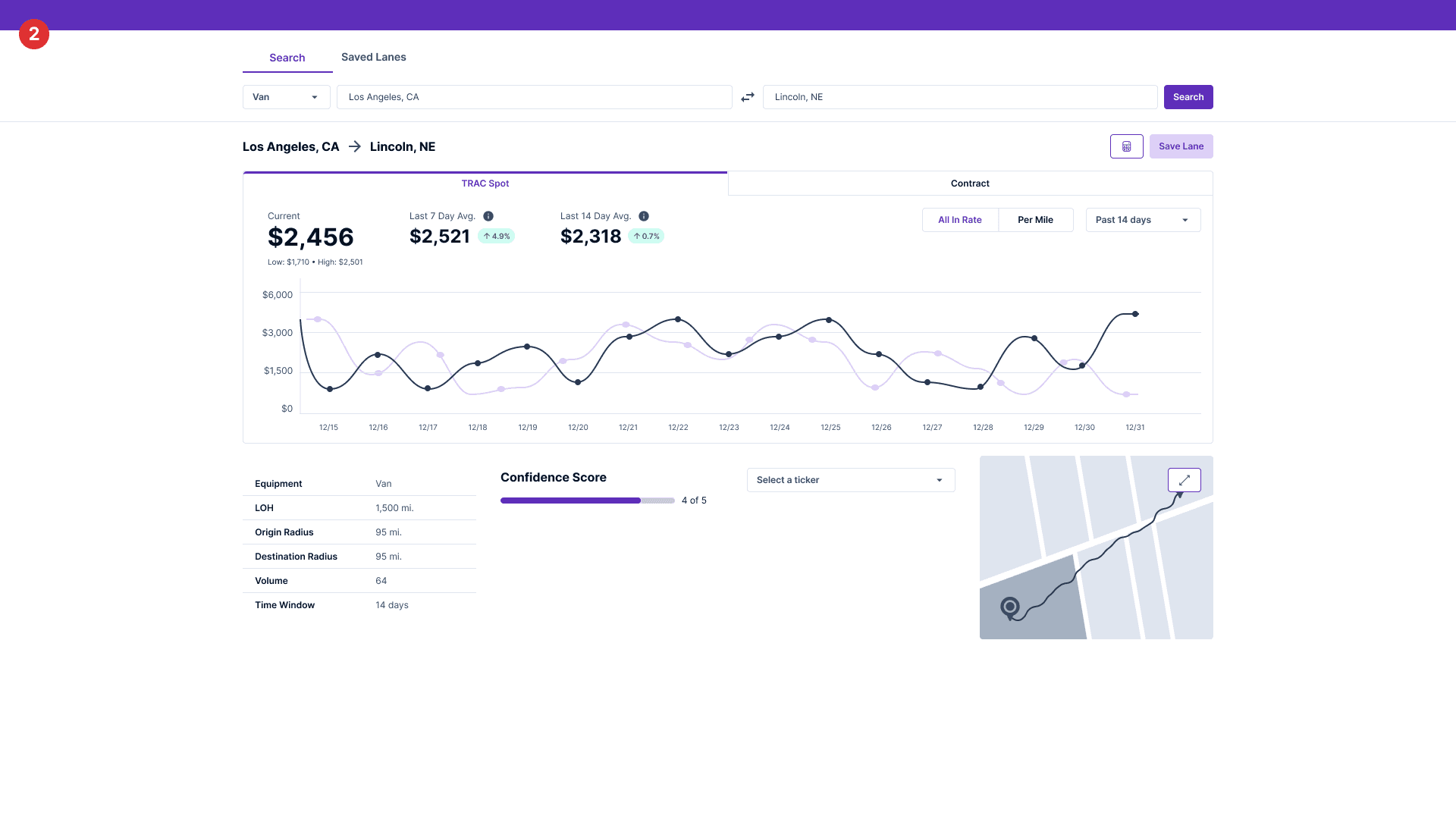
To streamline the wireframing process, we utilized a Figma plugin called Wireframy. This powerful tool includes an extensive library of pre-built UI components, which enabled us to create high-quality wireframes quickly and efficiently. By using Wireframy, we were able to iterate rapidly, testing multiple design concepts and refining them based on feedback.
The plugin’s flexibility and intuitive interface allowed us to focus on creating wireframes that were both functional and user-centered, providing a solid foundation for subsequent stages of the design process, including prototyping and user testing.

Usability Testing
We developed a high-fidelity prototype of the new screens in Figma and began recruiting participants that fit our criteria, ensuring that we included representatives from all key user types: shippers, brokers, and carriers. In the first round, we conducted 4 usability tests, gathering insights from each user group. After analyzing the issues identified, we iterated on the design and conducted 3 additional tests to validate the changes and refine the user experience.
issue 01
Users wanted an explanation on how the SPOT Rates were calculated.
solution 01
We added a tool tip explaining that rates were calculated.
issue 02
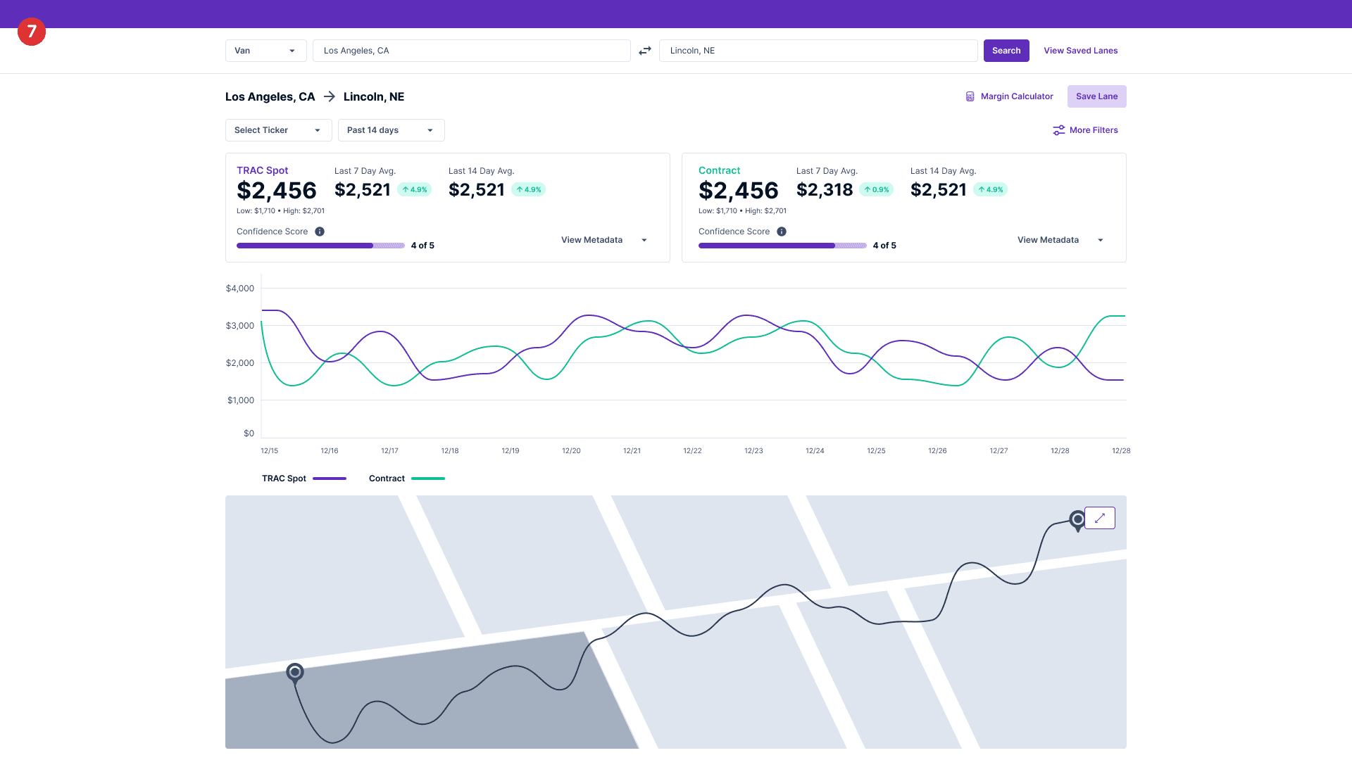
Users wanted a way to calculate the margin for the contract rate in addition to the TRAC Spot rate.
solution 02
We added a selector to the UI. Users can now specify if they want to calculate the margin with the all in rate or per mile rate.
issue 03
Users wanted to see the HAUL Index for today and week over week.
solution 03
We added this data to Today's Lane Insights.
issue 04
Users wanted to delete all saved lanes at once.
solution 04
We added a bulk delete feature to the Saved Lanes widget.
Next Steps
The next steps in this project involve continuing to design all screen views across desktop, tablet, and mobile breakpoints, ensuring a seamless and consistent experience across devices. Additionally, we will conduct further user testing on the desktop and mobile designs to validate usability and refine interactions based on user feedback. To ensure the product meets the highest standards, we will also perform comprehensive accessibility testing, ensuring compliance with accessibility guidelines and delivering an inclusive user experience for all.
From this project, I gained extensive experience with the MUI component library, discovering how it streamlines the process of designing consistent, sleek, and accessible user interfaces. The library’s pre-built components and customizable features allowed me to rapidly develop polished designs while maintaining a high level of usability. Additionally, I enhanced my Figma skills through an Udemy course focused on building responsive components and layouts. This course deepened my understanding of creating flexible, adaptive designs that cater to various screen sizes, further elevating my proficiency in designing intuitive and scalable user experiences.

